Wednesday, March 20, 2013

Photo evidence of shoot

Some pictures of us writing out the lyrics for our male artist to learn and be able to perform in green room, the first part of the music video. There's also evidence of me taking still images of our main female artist, images to use for my magazine advert and digipak. 


Thursday, March 7, 2013

Previous Rihanna digipak's


After looking various different digipak's, I thought it would be useful to look at a rihanna one, to see how hers compare to others. As you can tell it's all about giving the audience what they want, and that's rihanna been the sex icon that she is, looking gorgeous on her images and looking straight into the camera for the beat effect. Also making sure all the images and text fits to the genre if extremely important for an successful digipak. If the digipak doesn't look good it could potentially put off a lot of the audience buying it.

Digipak examples


Here are some examples of digipak's from various artist, I looked at these for inspiration and to get an idea of what type of things go on each different side. to compare how many images are normally used and how much text there also is, just to figure out what the best effective way is to create a good digipak.

Final Draft - Magzine Advert


For my final change to my magazine advert, I changed the realease date from '20th' to '23rd' because I checked what day the 20th of March was and it was a Wednesday so decided to change it to a Saturday which was the 23rd because it made more sense. As you dont really get people going out and buying an album in the mid week its normally on a weekend.

3rd of Magazine Advert


I have made one more change for my final draft of my magazine advert because I decided that the '20th' bit would look more effective if it matched the red colour like the rest of the advert. Didn't think it worked well adding a third colour to the advert, when nothing else was that colour. It also works better as a bright bold red because it's easy to see and eye-catching which is important because that particular text is important information that the audience need to see. 

2nd draft of magazine advert


On my magazine advert I included one main image of the main artist, a release date for the album and the artist name and album name. I didn't want to include too much text on the advert because I thought it would be more effective but also with the image I used it meant I couldn't include much text anyway, because ideally I needed to have my text down the left side or right at the bottom because otherwise the image just wouldn't have worked aswell. I decided to combine the artist name and album name into one, I thought this was actually quite effective and saved room on my advert. Having the album name in the colour red makes it obvious to the audience that, that is the album name. Totally distinguishing it from the first part of her name 'Georgia'. I also centered the release date towards the bottom because it is a really important part of the advert and it needs to be read by the audience so I thought this made it stand out more, I also made the '20th' part a slightly different colour to the rest of the sentence to again make it stand out more. I thought the white writing worked well against the black and white image making the text really viable to the audience,

1st draft of magazine advert


screen shots of making Magazine Advert

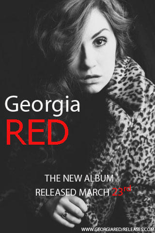
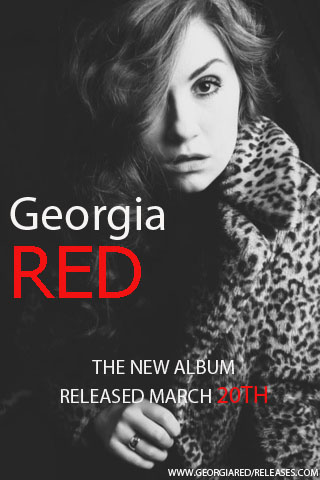
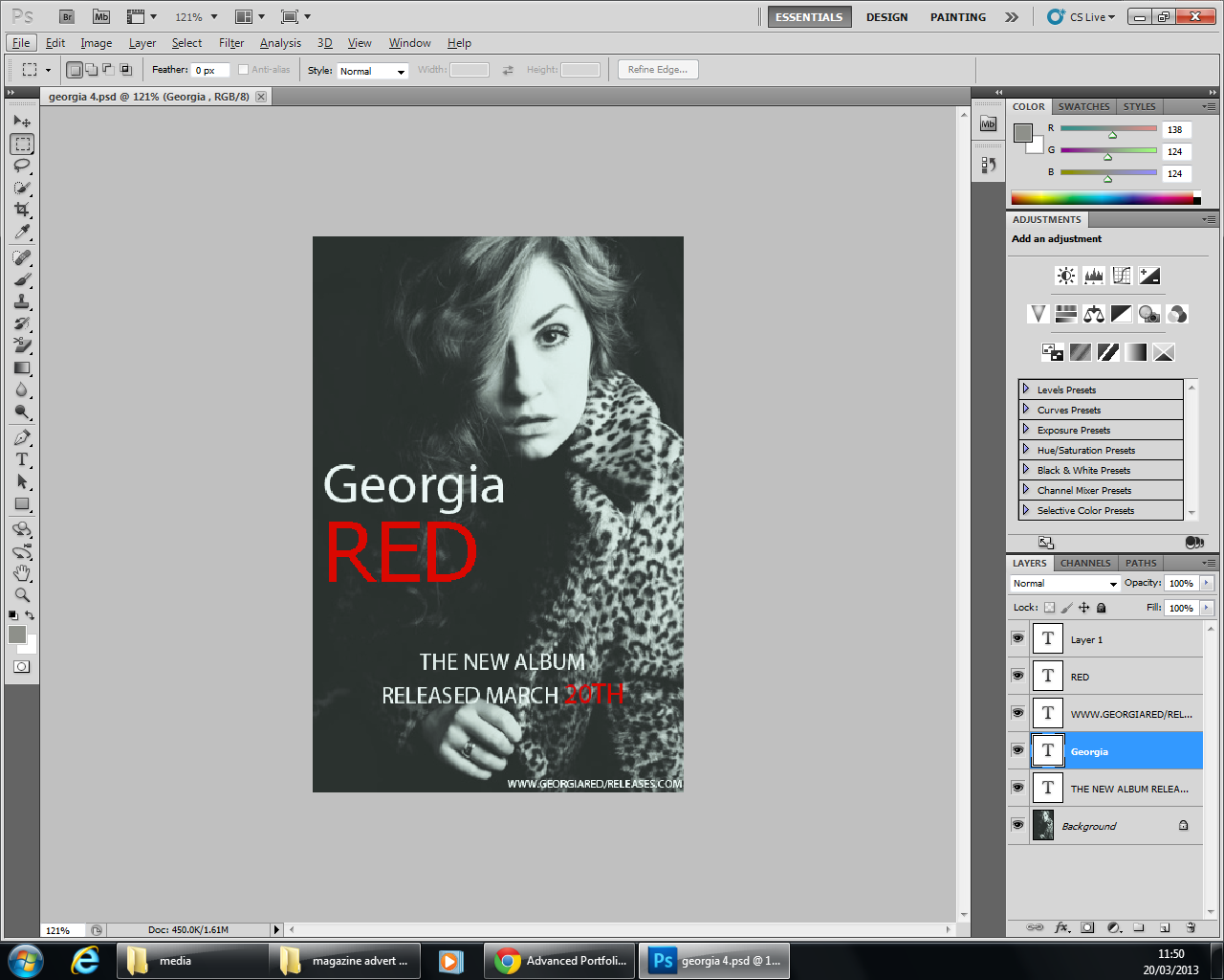
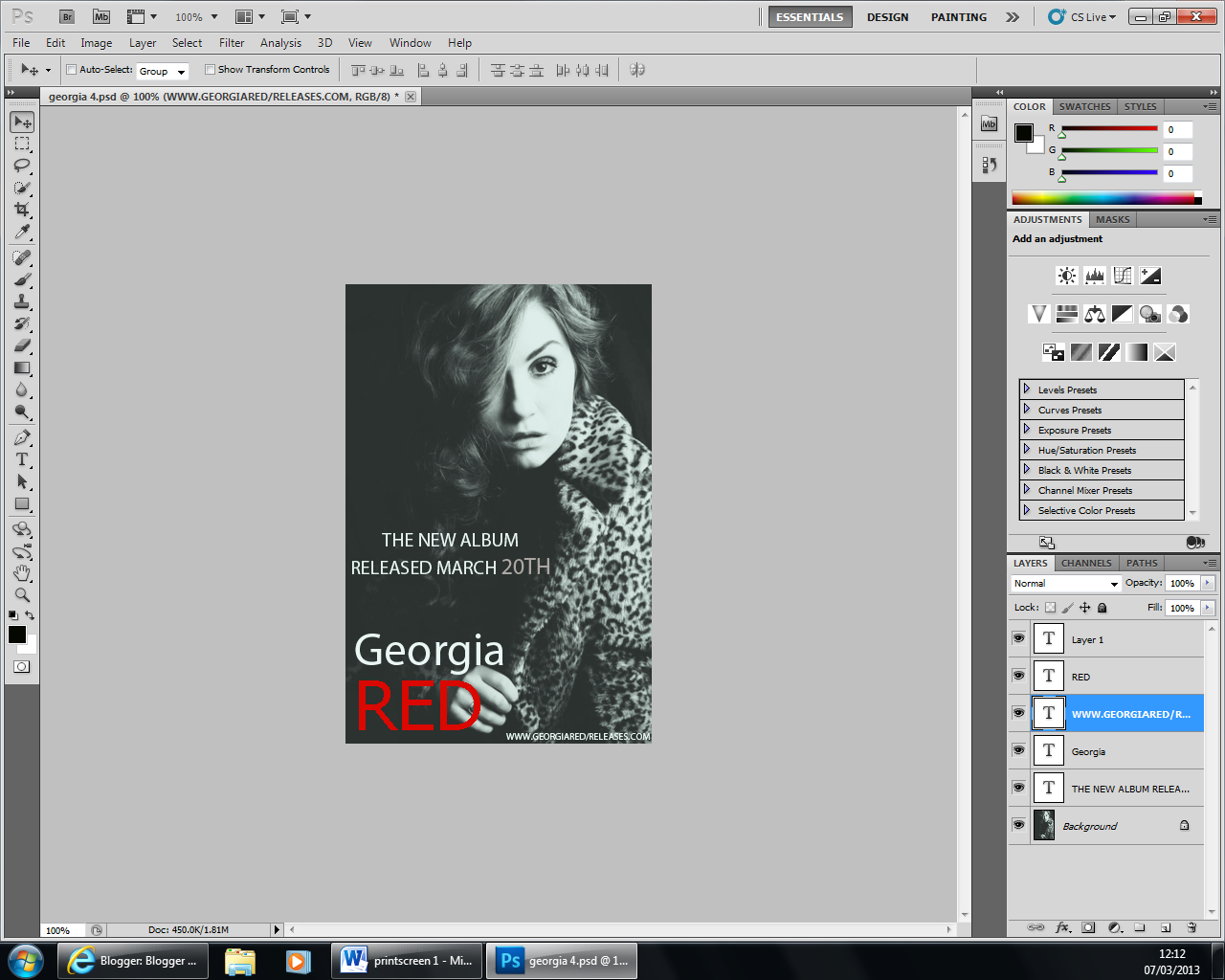
screen shot of final change to my magazine advert. I have changed the colour of the piece of text '20th' to red  because then it matches the text 'red' that is also the colour red and looks more effective and keeps it consistent. 


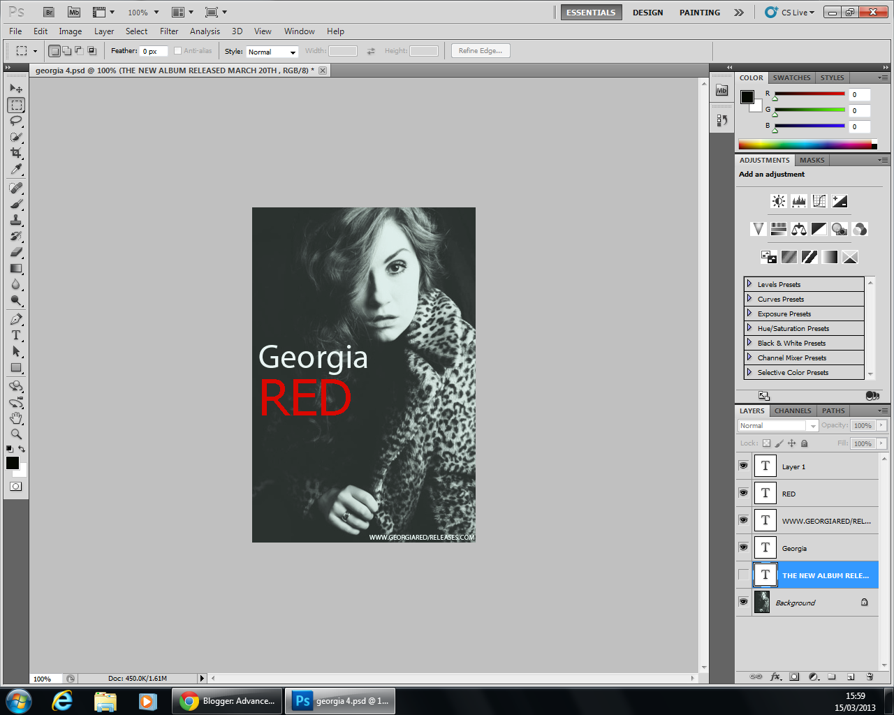
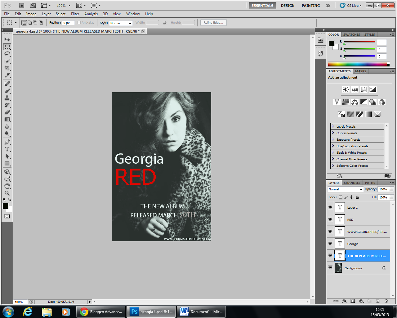
screen shots of 2nd draft...


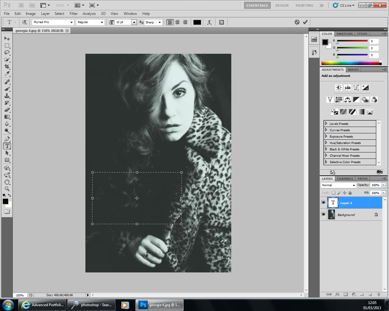
Screen shots of first draft ...


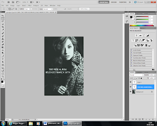
Before I started making my magazine advert I drafted and looked at examples of other real magazine adverts. I decided I wanted to have more of a plain but effective advert with not so much writing, so that the picture would catch the readers eye more, instead of having lots of writing on there because I felt like that would immediately put off the audience and they wouldn't even bother taking any interest. After looking at examples and having an understanding of what adverts worked best, I knew what arrangement I wanted with the picture and text on my advert. When I had made my first draft, I was happy with the picture and what text I had included but just wasn't quite pleased with the arrangement of text because the name of the artist and the album was at the bottom and the release date was in the middle, so I felt it should be the other way round because the artists name and album was more important information. Therefore changed things around and made my second and final draft which I thought worked better and was far more effective.

Pictures for my magazine advert

Here are some pictures of Georgia that I intend to use on either my magazine advert or my digipak.